
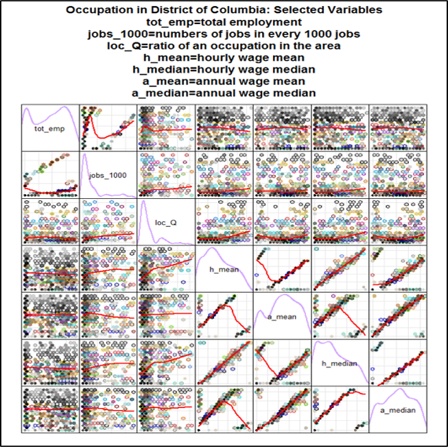
Relationships between different variables in D.C Area in 2014
showed on the last page, we observe the data from District of Columbia, the capital of United States that we are most familiar with. A regression matrix plot was decided to build the understanding of the density of 2-2 variables grouping relation, it reveals data density
and smooth with scatterplot matrix. The goal of drawing this diagram is to find the factor variables that affects each other. The advantage of this redesign graph is that We set some values such as ratio of an occupation in D.C area, mean annual wage for each occupation, median annual wage in each occupation and so on, which are compared two by two in order to find whether they are highly related, general related or less related. Also, in this matrix, there are some density plots, more colorful parts, it represents the data could be more dispersion. Whereas, the more black or grey, the data is more concentration. Therefore, there might be more relationship existing the density parts. With this regard, we add the panel. Loess() function to explore and examine the different weights/ coefficients which impacts the dependent variable. The panel. Loess is a fitting and regression model for variable data. The panel loess line (shows a red line in each density plot) describes the relationships between the two-dimensional variable. Obviously, the more flattered of the line, the two variables could be more general relationship. If the line is more inclined, the relationship between two variables could be highly relevant.